TSA Prediction Market: Part 3 - Baseline model

Overview
- Introduction
- Data Analysis
- TSA traffic data
- Modeling!
- Distribution of residuals
- Checking for autocorrelation
- Conclusion
- The Series
Introduction
Last time, we looked for some supplementary data sources that could assist in predicting next week’s TSA traffic.
This time, we will develop our first baseline model. We want to build the most simple model possible as our starting point. Additional posts will attempt to improve model performance from this baseline.
Let’s get started
Data Analysis
TSA traffic data
First, we want to look at the data that we will trying to predict. This will help us identify any patterns that we will need to pick up on.
In forecasting, we can identify 3 main concepts to describe time series data
- Trend - Overall long-term movement
- Seasonality - Recurring patterns based on time periods.
- Cyclicality - Patterns that are not tied to specific time periods.
Please refer to Hyndman’s Forecasting: Principles and Practice for a more detailed discussion of these distinctions.
Here we have plotted the TSA Passenger data since 2019 on a day granularity. We can clearly see a large dip in traffic at the beginning of 2020. This is because of Coronavirus and could make modeling more difficult. We will have to figure out the best way of handling that data later.
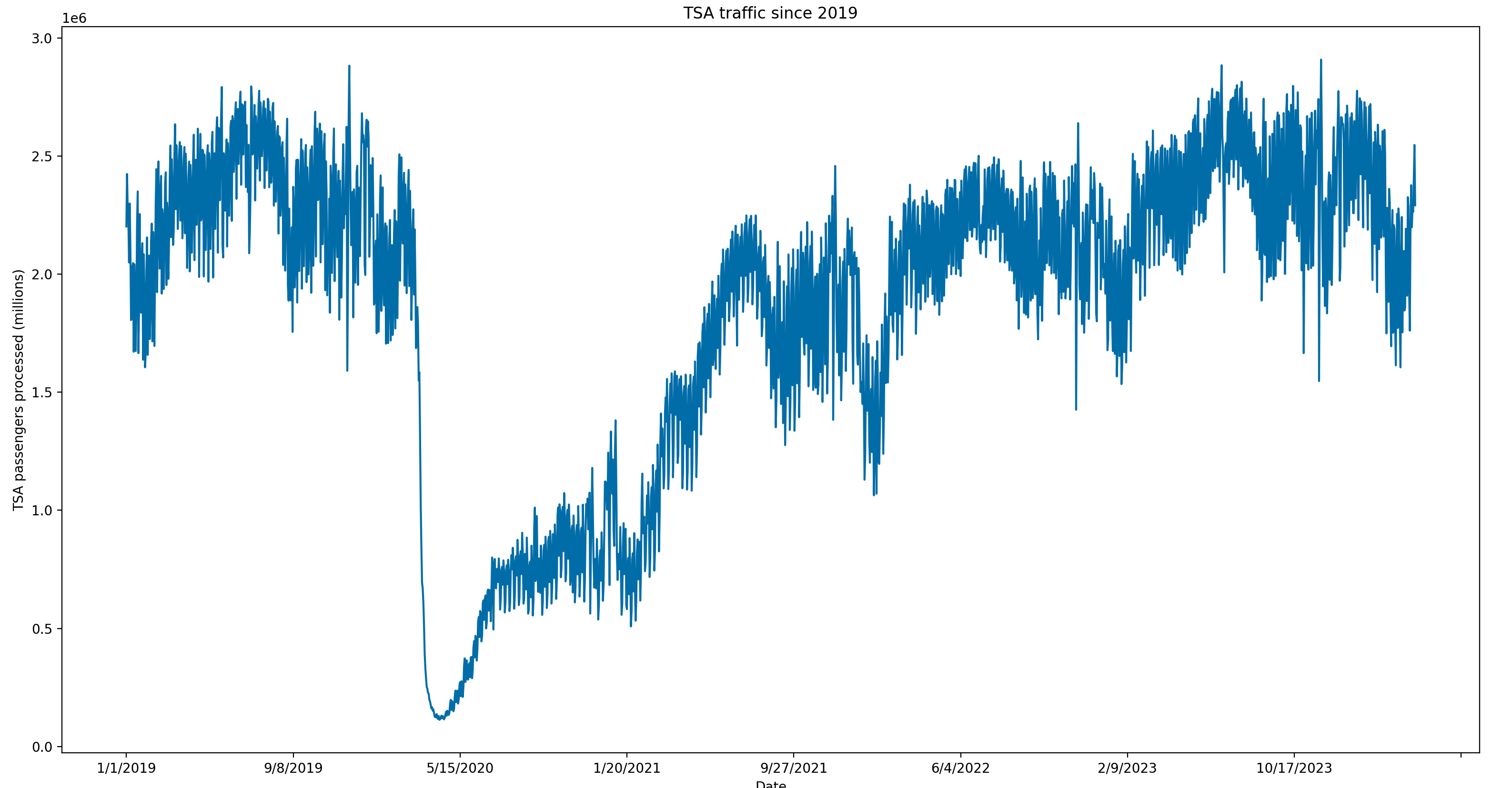
For now, we can see the trend is a gradual recovery since Coronavirus that may have been stagnating in recent months. Because of the granularity of this data, it is difficult to clearly see any trends.
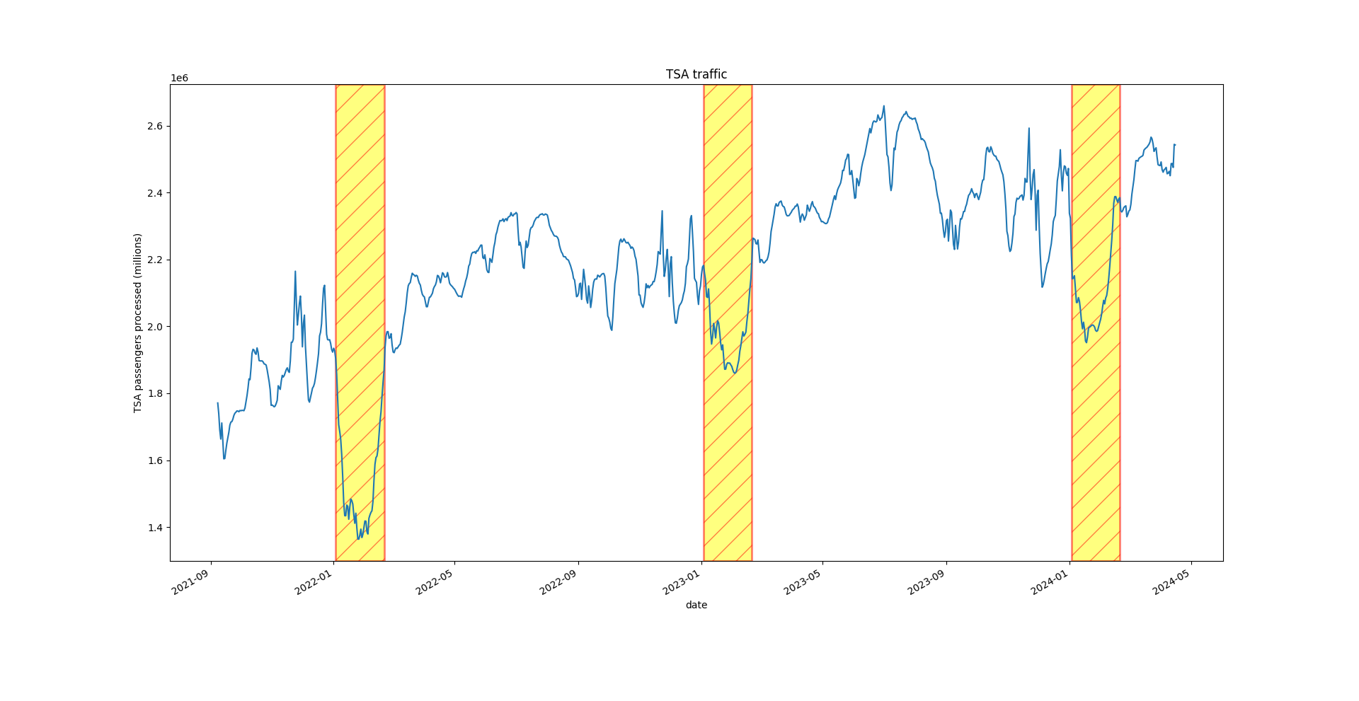
Let’s make the data less noisy by taking a 7-day moving average and plotting that. We will also limit data to late 2021 and after to avoid peak Covid time period.
def plot_tsa_traffic():
    """
    This function loads TSA passenger data from a CSV file, processes the data to calculate a 7-day moving average,
    and then plots this moving average over time. It also highlights specific date ranges (early January to late
    February of each year) on the plot.

    The steps involved are:
    1. Load TSA data from a CSV file.
    2. Rename columns for clarity.
    3. Convert the date column to datetime format.
    4. Filter data to include only dates after September 1, 2021.
    5. Calculate a 7-day moving average of the number of passengers.
    6. Plot the 7-day moving average over time.
    7. Highlight specific date ranges on the plot.
    8. Set the y-axis label and display the plot.
    """

    tsa_data = pd.read_csv("../data/tsa_data.csv", index_col=0)

    # Standardize column names
    tsa_data.rename(columns={"Date": "date", "Numbers": "passengers"}, inplace=True)

    # Get date column in datetime
    tsa_data['date'] = pd.to_datetime(tsa_data['date'],format='%m/%d/%Y')

    # Older data is abnormal because of covid. Only use most recent data
    tsa_data = tsa_data[tsa_data['date'] > '2021-09-01']

    # We need weekly average passengers due to market structure
    tsa_data['passengers_7_day_moving_average'] = tsa_data['passengers'].rolling(window=7).mean()

    plt.figure()
    ax = tsa_data.plot("date", "passengers_7_day_moving_average", legend=False, title="TSA traffic")

    # Highlight specific seasonal dips
    highlight_ranges = [(datetime(2022, 1, 3), datetime(2022, 2, 20)),
                        (datetime(2023, 1, 3), datetime(2023, 2, 20)),
                        (datetime(2024, 1, 3), datetime(2024, 2, 20))]

    for start, end in highlight_ranges:
        plt.axvspan(start, end, facecolor='yellow', alpha=0.5, hatch='/', edgecolor='red', linewidth=2)

    ax.set_ylabel("TSA passengers processed (millions)")

    plt.show()
Now, some more interesting trends begin to emerge. We can see clear dips in TSA traffic in the first two months of every year. This makes intuitive sense as many people travel in December, so are unlikely to travel again so soon.
We can also see clear passenger peaks in the Summer for the past 2 years.
Now, let’s start looking at the relationship between our supplementary data and the TSA traffic numbers.
Modeling!
Baseline model
I like to work iteratively. I start with the most basic model possible and only add complexity if the accuracy improvement is significant.
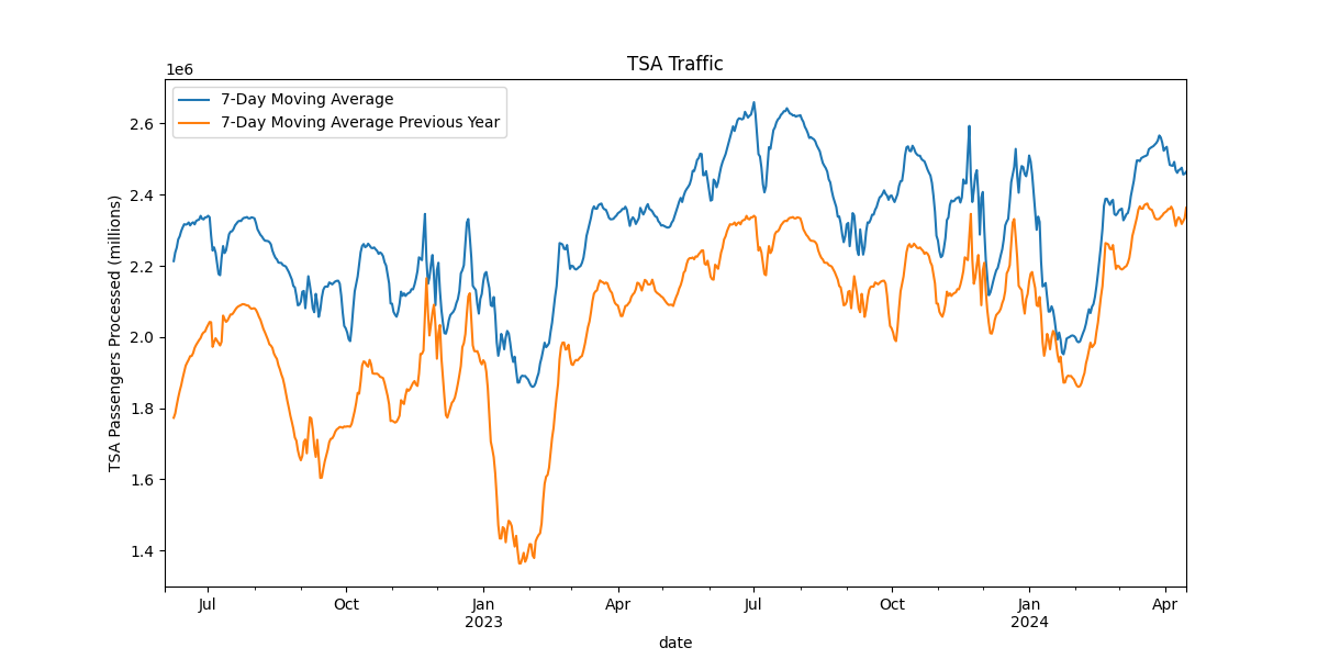
So, for our most basic model possible, we will create a model that predicts the TSA traffic for the previous year. In the below graph, we overlay the traffic from one year ago compared to current day’s traffic. This does a pretty good job capturing seasonality, but the previous year is regularly lower.
y-hat = yt-1
Note: Need additional research to figure out LaTex in Github pages
Now we want a metric to easily gauge the accuracy of our model without resorting to “eyeballing” it on a chart. Let’s calculate our root mean squared error with this method.
RMSE: 277989.8467788747
def get_model_error():
    """
    Calculate the root mean squared error (RMSE) between the actual TSA passenger data and the model predictions.

    Steps:
    1. Load and process the data to create lagged features.
    2. Calculate recent trends and generate predictions.
    3. Drop rows with missing values.
    4. Calculate and print the RMSE.
    """
    # Load and process the data to create lagged features
    tsa_data = lag_passengers()

    # Calculate recent trends and generate predictions
    tsa_data = get_recent_trend(tsa_data)

    # Drop rows with missing values
    tsa_data.dropna(inplace=True)

    rms = root_mean_squared_error(
        tsa_data['passengers_7_day_moving_average'],
        tsa_data['prediction']
    )

    print(f"RMSE: {rms}")
This means that our predicted value is, on average, about 277,000 passengers
away from the actual value. Not bad, but let’s see if we can
do better.
Taking into account trend
Our baseline model is not taking into account the rising trend overtime. TSA Traffic this year is consistently above TSA Traffic from the prior year. So, we want to account for this somehow.
Let’s take the year-over-year difference for a recent week and apply that factor in our predictive model. For example, if a recent week had 3,000,000 passengers and that same week last year had 2,800,000 passengers, we would say there was about a 7% increase year-over-year.
Then, our new model becomes:
y-hat = α ⋅ yt-1
where:
- α is the trend factor based on the recent week’s year-over-year change.
- y-hat is the predicted value at time t
- yt-1 is the value last year
def lag_passengers():
"""
Load TSA passenger data, process it to create lagged features, and return the processed dataframe.
Steps:
1. Load TSA data from a CSV file.
2. Rename columns for clarity.
3. Convert the date column to datetime format.
4. Set the date column as the index and sort the index.
5. Create a new column with passenger data from the previous year.
6. Filter data to include only dates after June 1, 2022.
7. Calculate a 7-day moving average of the number of passengers.
8. Calculate a 7-day moving average of the previous year's passenger data.
"""
# Load TSA data
tsa_data = pd.read_csv("../data/tsa_data.csv", index_col=0)
# Rename columns for clarity
tsa_data.rename(columns={"Date": "date", "Numbers": "passengers"}, inplace=True)
# Convert date column to datetime format
tsa_data['date'] = pd.to_datetime(tsa_data['date'], format='%m/%d/%Y')
# Set the date column as the index and sort the index
tsa_data = tsa_data.set_index('date')
tsa_data.sort_index(inplace=True)
# Create a new column with passenger data from the previous year
tsa_data['previous_year'] = tsa_data['passengers'].shift(365)
# Filter data to include only dates after June 1, 2022
tsa_data = tsa_data[tsa_data.index > '2022-06-01']
# Calculate a 7-day moving average of passengers
tsa_data['passengers_7_day_moving_average'] = tsa_data['passengers'].rolling(window=7).mean()
# Calculate a 7-day moving average of the previous year's passenger data
tsa_data['passengers_7_day_moving_average_previous_year'] = tsa_data['previous_year'].rolling(window=7).mean()
return tsa_data
def get_recent_trend(tsa_data):
"""
Calculate recent trends in TSA passenger data and create predictions based on these trends.
Steps:
1. Calculate the current trend as the ratio of the 7-day moving average of passengers to the previous year's 7-day moving average.
2. Create a lagged trend feature.
3. Generate predictions using the previous year's 7-day moving average and the lagged trend.
"""
# Calculate the current trend
tsa_data['current_trend'] = tsa_data['passengers_7_day_moving_average'] / tsa_data[
'passengers_7_day_moving_average_previous_year']
# Create a lagged trend feature (Use 2 weeks ago in case data isn't available for previous week
tsa_data['last_weeks_trend'] = tsa_data['current_trend'].shift(7)
# Generate predictions using the previous year's 7-day moving average and the lagged trend
tsa_data['prediction'] = tsa_data['passengers_7_day_moving_average_previous_year'] * tsa_data['last_weeks_trend']
return tsa_data
def graph_lagged_data():
"""
Load TSA passenger data, process it to create lagged features and predictions, and plot the results.
Steps:
1. Load and process the data to create lagged features.
2. Calculate recent trends and generate predictions.
3. Save the processed data to a new CSV file.
4. Plot the 7-day moving average and the predictions.
"""
# Load and process the data to create lagged features
tsa_data = lag_passengers()
# Calculate recent trends and generate predictions
tsa_data = get_recent_trend(tsa_data)
# Save the processed data to a new CSV file
tsa_data.to_csv("../data/tsa_data_new.csv")
# Print the first few rows of the dataframe
print(tsa_data.head())
# Plot the 7-day moving average and the predictions
plt.figure(figsize=(12, 6))
ax = tsa_data['passengers_7_day_moving_average'].plot(label="7-Day Moving Average",
title="TSA Traffic vs. Predictive Model")
tsa_data['prediction'].plot(ax=ax, label="7-Day Moving Prediction")
# Set the y-axis label
ax.set_ylabel("TSA Passengers Processed (millions)")
# Add legend
ax.legend()
# Show the plot
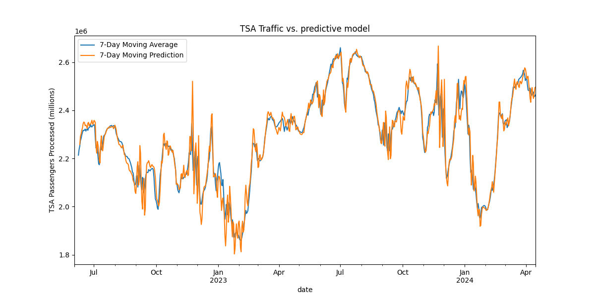
plt.show()This simple rule based model seems to do surprisingly well with an RMSE reduction from 277,989 to 43,282.
RMSE: 43282.031348488825
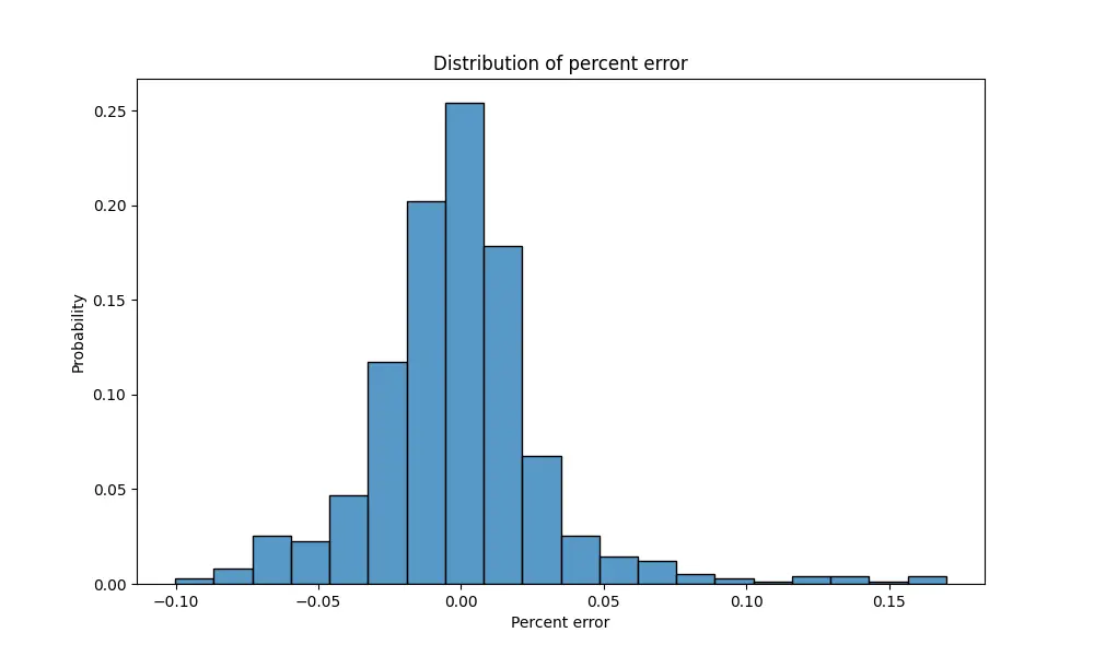
Distribution of residuals
Here we look at another way to gauge the accuracy of our model. This will be important for determining how much confidence we assign to these prediction when making trades.
Below is a chart showing the distribution of residuals. Specifically, we take the percent difference between actual TSA Volumes and our predicted value. We can see that about 90% of instances fall within 5 percentage points of our prediction.
Checking for autocorrelation
What is autocorrelation?
Currently, our model applies the previous 7 day YoY (year-over-year) trend to new days. Is there any way we can further improve this algorithm? What if yesterday’s YoY trend is abnormally low. Does that make today more likely to have another low YoY trend? Does yesterday’s deviation from longer term trend indicate anything about today’s trend? If so, this is called autocorrelation. Autocorrelation is the relationship between lagged values of a time series
If recent trend have been a 4% increase YoY, we can expect additional days to be around that number. So in our case, what we really care about is autocorrelation taking into account the normal trend.
Checking the residuals
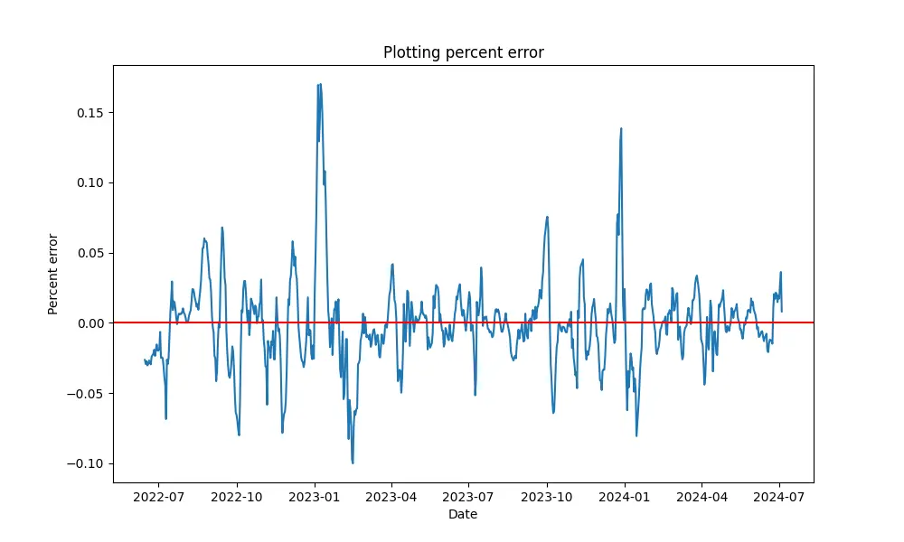
Here we plot the residuals to see if there is a trend. We can see that positive residuals are more frequently followed by positive residuals. This implies autocorrelation that we can take advantage of in our model.
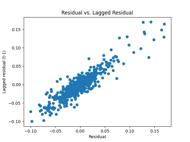
Another chart checking for autocorrelation. Here we graph the residual vs the lagged residual (t-1) to check for correlation. This shows an even more clear illustration of the correlation.
We will adjust the YoY trend in our previous model to weight the most recent day’s YoY trend more heavily.
Conclusion
In today’s post, we built a simple baseline model to predict future TSA traffic.
Next time, we will discuss how to use this model to place trades using the Kalshi API.
The Series
Now, that the introduction is out of the way, let’s get started. Below are the different blog posts that are part of this series.
Please reach out if you have any feedback or want to chat.
-
Part 1: Web scraping to get historical data from the TSA site
-
Part 2: Finding supplementary data to help build our model (Note: I ended up not using this data in the model)